Cursor Usage Page Tutorial 2026 — How to Track Your Real Spending After Cursor Removed Dollar Amounts
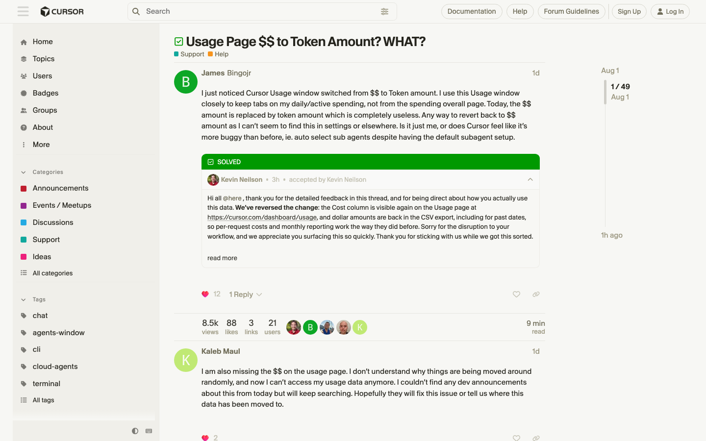
The Problem: Cursor’s Usage Page Stopped Showing Dollars
On July 31, 2026, Cursor users noticed something unsettling: the Usage window switched from dollar amounts to token counts. For individual plan users, the cost column on the usage page is gone, replaced by tokens — with anything covered by the plan marked “Included.”
The community reaction was immediate. A forum thread titled “Usage Page $$ to Token Amount? WHAT?” filled with complaints, and it hit Hacker News front page with 289 points. The core grievance, from user eli.wavv: “Cursor needs to be transparent about the per-request cost if that is what we are being billed for (with on-demand usage). This is unacceptable and makes it impossible for team members to track their own personal usage when working on a team with a shared on-demand usage cap.”
Cursor’s official response (from kevinn, a Cursor staff member) explained the change was deliberate: individual plans display token counts because the dollar amounts shown earlier were “often higher amounts than the user’s plan cost” due to generous included usage — causing confusion. But the dollars are still there, just moved.
This tutorial shows you exactly where the real numbers live, how to export them, and how to set up a budget workflow that survives Cursor’s UI changes.
Step 1: Understand What the Usage Page Shows Now
After the change, the Usage page for individual plans shows:
- Token counts for everything, with rows covered by your plan marked “Included”
- A Cost column that only shows dollar figures for on-demand usage — the stuff you actually pay for beyond your included allowance
The key mental model: Included ≠ free, it means “already paid for by your subscription.” Token counts show you what you consumed; the Cost column shows what you’ll be billed on top of the subscription.
Enterprise plans are unaffected and still show dollar amounts throughout — the change only hit individual plans, because enterprise plans use pooled usage with a different billing structure.
Step 2: Find the Real Dollar Figure — Dashboard → Spending
The single number that matches your invoice lives in one place:
- Open Cursor → Settings (⌘, on macOS / Ctrl+, on Windows/Linux)
- Go to the Dashboard tab
- Look for Spending → On-Demand Spending
That figure is your current billing-cycle on-demand cost — “the number matching what you will be billed” per Cursor’s staff reply. Check it at the start and end of each billing cycle if you want a monthly spend figure.
Why the old usage-page dollars confused people: the amounts shown there were often higher than the plan cost because they reflected the full value of included usage, not what you’d be charged. The new token view fixes that confusion but created a transparency gap for users who used the usage page as their daily budget dashboard.
Step 3: Export the Full Breakdown — Usage → Export CSV
For per-request and per-row dollar data, use the CSV export:
- Settings → Dashboard → Usage
- Set your date range (e.g., last 30 days, or current cycle)
- Click Export CSV
The exported CSV includes a Cost column with dollar amounts for every on-demand row. This is your audit trail: which requests actually cost money, and how much.
Pro tip: the CSV is the only place you get per-row dollar granularity on individual plans now. Export it weekly if you’re cost-sensitive, and keep a copy — it doubles as your expense report for the shared-cap team scenario the forum thread complained about.
Step 4: Build a Budget Workflow (That Survives UI Changes)
The 2026 lesson from this episode: don’t depend on one UI surface for cost data. Set up a workflow that reads from durable sources:
- Track the On-Demand Spending figure (Dashboard → Spending) at cycle boundaries. It’s the number that matches your bill — treat it as your source of truth for billing.
- Export CSV weekly to a folder (e.g.,
~/cursor-cost-tracking/). Name files with dates:cursor-usage-2026-08-02.csv. Now you have a history that survives UI redesigns. - If you’re on a team with a shared on-demand cap, the forum thread’s pain point applies directly: individuals can’t see their own share in the UI. Have your admin export the org-level CSV, or agree on a per-member request budget and self-report against it.
- Watch for the on-demand trigger. Requests within your included allowance show as “Included” tokens; only overflow rows carry dollar costs. Knowing where that boundary sits (check your plan’s included-usage limit) tells you when the Cost column will start appearing on your rows.
- Use the token data for optimization. Even without dollars, the token counts tell you which agentic sessions burn context. Large token rows are almost always multi-file agent runs or deep-context refactors — those are the ones to break into smaller tasks if you’re near your cap.
Step 5: If You Want the Old Dollar View Back
Cursor’s staff reply was explicit: “There isn’t currently a setting to switch back to dollar amounts for individual plans.” As of August 2, 2026, there is no revert toggle.
What you can do:
- Vote with your voice: the HN thread (289 points) and forum thread are the feedback channels Cursor monitors — the “Usage Page $$ to Token Amount? WHAT?” thread is where users are consolidating the request.
- Feature request: file/upvote a formal request in Cursor’s forum for a “show dollars” display option alongside tokens.
- Workaround: keep the Dashboard → Spending number + weekly CSV exports as your dollar pipeline until (or unless) Cursor restores per-row dollars on individual plans.
Community Reaction Recap
The HN thread (289 points) captured the full range of sentiment:
- The transparency complaint (
eli.wavv): team members on shared on-demand caps can’t track their own usage — the exact scenario Cursor’s change made harder. - The bug-report framing (
Kaleb_Maul): “I am also missing the $$ on the usage page. I don’t understand why things are being moved around randomly, and now I can’t access my usage data anymore.” - The staff clarification (
kevinn): the split (tokens = included, dollars = on-demand only) is intended design; Enterprise still shows dollars; CSV export has the per-row dollars.
Summary
Cursor’s July 31 usage-page change moved dollars out of the daily dashboard and into two places: Dashboard → Spending (the bill-matching figure) and Usage → Export CSV (per-row granularity). Set up the weekly-export habit and track the On-Demand Spending figure at cycle boundaries, and you’ll know exactly what you owe — regardless of how Cursor reshuffles its UI next.